Appearance
Styling
The app is fully functional — now let's make it look good too. Tailwind CSS provides low-level utility classes that compose into layouts, and DaisyUI layers a set of semantic component classes on top — btn, card, alert — so you get good-looking UI without writing a single line of custom CSS. The Heroicons icon set rounds it out.
lustre_dev_tools knows how to drive the Tailwind CLI directly, so a tiny package.json for the npm-distributed plugins and a few gleam.toml entries are all the wiring needed. Nine files change, three are new[1]:
sh
doable/
└── client/
    ├── .gitignore                  # /node_modules added
    ├── gleam.toml                  # lustre.bin: bun + tailwind
    ├── package.json                # tailwindcss, daisyui, iconify
    └── src/
        ├── client.css              # CSS entry point
        ├── component/
        │   └── task_form.gleam     # DaisyUI form controls
        └── page/
            ├── tasks.gleam         # styled task list
            ├── new_task.gleam      # styled new task form
            └── edit_task.gleam     # styled edit task form
Install Bun
Bun is a fast JavaScript runtime and package manager — we use it here only to install Tailwind, DaisyUI, and the Iconify packages from the npm registry. Any npm-compatible tool (npm, pnpm, yarn) works just as well; adapt the bun commands if you prefer one of those.
sh
brew install oven-sh/bun/bunsh
curl -fsSL https://bun.sh/install | bashsh
powershell -c "irm bun.sh/install.ps1 | iex"sh
npm install -g bunThe official install guide covers more options. Restart the shell, then verify with:
sh
bun --versionInstall Dependencies
Four packages join the project: the Tailwind CLI, DaisyUI, and Iconify's Tailwind plugin together with the Heroicons icon data.
sh
cd client
bun add --dev @tailwindcss/cli @iconify/tailwind4 @iconify-json/heroicons daisyui
bun creates a fresh package.json and a bun.lock. The package.json should look like this:
json
// client/package.json

{
  "private": true,
  "devDependencies": {
    "@iconify-json/heroicons": "^1.2.3",
    "@iconify/tailwind4": "^1.2.3",
    "@tailwindcss/cli": "^4.2.4",
    "daisyui": "^5.5.19"
  }
}- @tailwindcss/cli — the standalone Tailwind compiler, which
lustre_dev_toolsinvokes duringstartandbuild. - daisyui — semantic component classes (
btn,card,alert,checkbox, …) that map to Tailwind utilities under the hood. - @iconify/tailwind4 — a Tailwind plugin that generates utility classes for icon sets, e.g.
icon-[heroicons--plus]. - @iconify-json/heroicons — the Heroicons icon data consumed by the Iconify plugin.
bun add also drops a node_modules/ directory next to package.json. Add it to .gitignore so it stays out of version control:
sh
# Gleam
*.beam
*.ez
/build
erl_crash.dump

#Added automatically by Lustre Dev Tools
/.lustre
/dist

# Bun
/node_modules
Wiring Tailwind into Lustre Dev Tools
lustre_dev_tools can run external binaries as part of its dev and build pipelines. Two new gleam.toml entries point it at bun and at the Tailwind CLI binary that bun add placed inside node_modules:
toml
# client/gleam.toml

[tools.lustre.bin]
bun = "system"
tailwindcss = "./node_modules/.bin/tailwindcss"
bun = "system" tells lustre_dev_tools to use whichever bun is on PATH. Pointing tailwindcss at the project-local binary keeps the CLI version pinned by bun.lock rather than tied to whatever happens to be globally installed.
CSS Entry Point
Tailwind v4 is configured entirely through CSS — no tailwind.config.js. Create src/client.css with three lines:
css
/* client/src/client.css */

@import "tailwindcss";
@plugin "daisyui";
@plugin "@iconify/tailwind4";
@import "tailwindcss" activates the full utility class engine. The two @plugin lines load DaisyUI and Iconify as CSS-layer plugins. That's the entire configuration.
lustre_dev_tools picks src/client.css up automatically (matching the project name), runs it through the Tailwind CLI, and links the result into the generated HTML — no manual import in any .js file is needed.
DaisyUI Approach
DaisyUI's design philosophy pairs well with Lustre's. Component classes (btn, card, form-control) name what something is, while Tailwind modifier classes (flex, gap-3, mt-6) describe how it's arranged. The two layers stay separate — DaisyUI for semantics, Tailwind for layout — so views remain readable even when class lists grow long.
A pattern that appears throughout is using Gleam's case expression to conditionally compose class strings:
gleam
attribute.class(case task.completed {
  True -> "font-medium line-through text-base-content/50"
  False -> "font-medium"
})
Because attribute.class takes an ordinary string, conditional styling is just a case expression — no special utilities or class-merging helpers needed.
Sorting Tailwind classes
Rustywind sorts Tailwind utility classes into a consistent canonical order — the same order the Tailwind Prettier plugin produces. To sort class strings inside attribute.class(...) calls, run it with a custom regex from the client directory:
sh
rustywind --write --custom-regex 'attribute\.class\("([^"]+)"' src/Tasks Screen
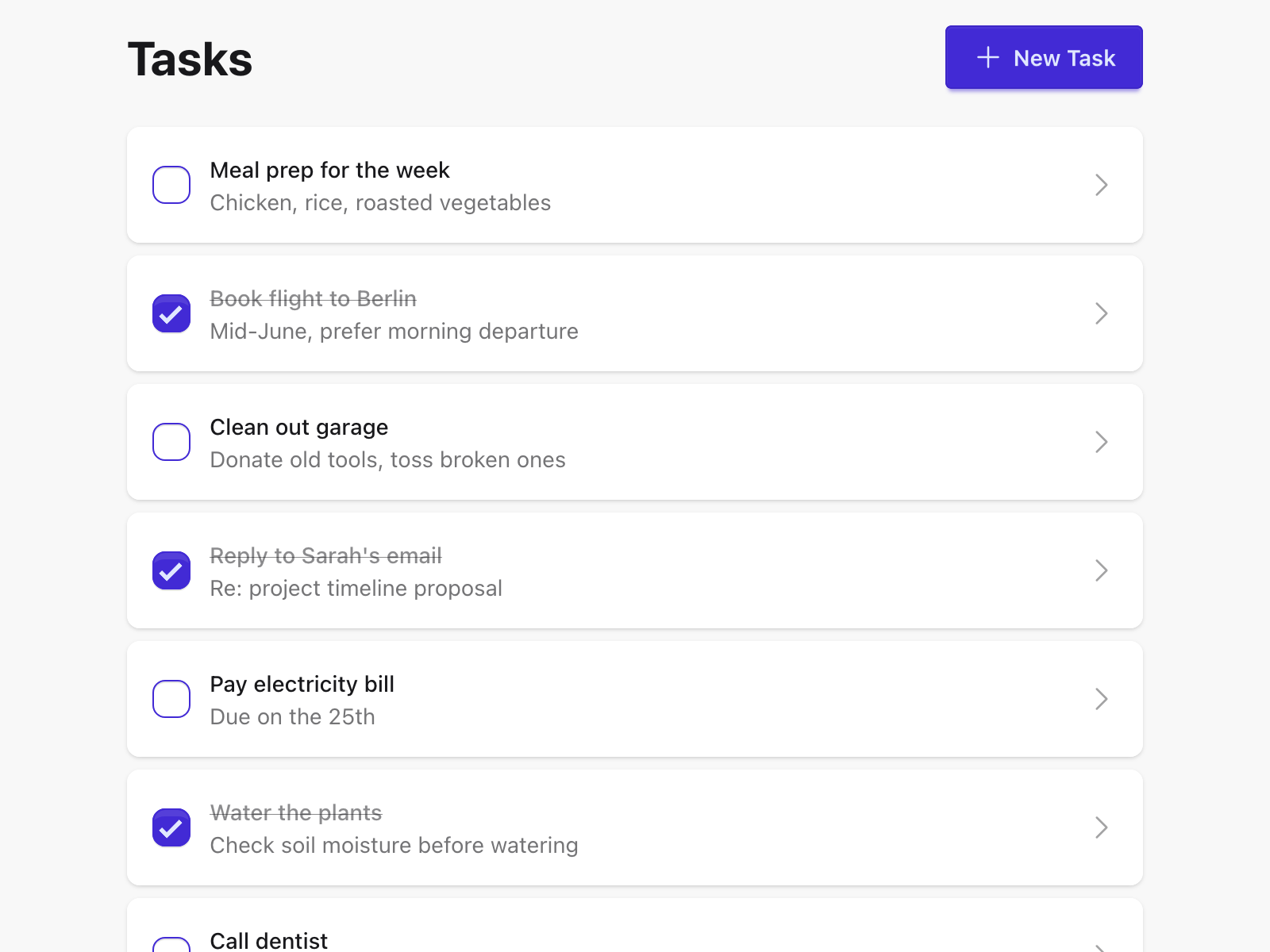
tasks.gleam gets a full layout: a centred container, a header row with the page title and a primary "New Task" button, and a card list for the tasks themselves.
The outer container uses min-h-screen bg-base-200 to fill the viewport with DaisyUI's subtle background colour, while container mx-auto max-w-2xl centres the content and caps its width.
gleam
// client/src/page/tasks.gleam

pub fn view(model: Model) -> Element(Msg) {
  html.div([attribute.class("min-h-screen bg-base-200")], [
    html.div([attribute.class("container p-4 mx-auto max-w-2xl")], [
      html.div([attribute.class("flex justify-between items-center mb-6")], [
        html.h1([attribute.class("text-3xl font-bold")], [
          element.text("Tasks"),
        ]),
        html.a(
          [
            attribute.href(route.to_path(route.NewTask)),
            attribute.class("btn btn-primary"),
          ],
          [
            html.span(
              [attribute.class("icon-[heroicons--plus] size-5")],
              [],
            ),
            element.text("New Task"),
          ],
        ),
      ]),
      case model.tasks {
        Error(err) ->
          html.div([attribute.class("alert alert-error")], [
            element.text(error.message(err)),
          ])
        Ok([]) if model.loading ->
          html.div(
            [attribute.class("flex justify-center p-8")],
            [
              html.span(
                [attribute.class("loading loading-spinner loading-lg")],
                [],
              ),
            ],
          )
        Ok([]) ->
          html.div([attribute.class("shadow card bg-base-100")], [
            html.div([attribute.class("items-center text-center card-body")], [
              html.p([attribute.class("text-base-content/60")], [
                element.text("No tasks yet"),
              ]),
            ]),
          ])
        Ok(tasks) ->
          html.ul([attribute.class("space-y-2")], list.map(tasks, view_task))
      },
    ]),
  ])
}
A few details worth noting:
- The "New Task" link becomes
btn btn-primarywith aheroicons--plusicon rendered via an emptyspan— Iconify generates a CSS mask-image from the icon data at build time, so there's no SVG in the Gleam source at all. loading loading-spinner loading-lgis a DaisyUI animated spinner — the loading state upgrades from plain text to a proper indicator.alert alert-errorreplaces the bare<p>for errors, giving it the red alert styling DaisyUI provides.- The empty state ("No tasks yet") is wrapped in a
cardso it sits visually consistent with the rest of the list.
Each task row becomes a card with two independent interactive targets — a checkbox to toggle completion and a link to open the edit page:
gleam
fn view_task(task: Task) -> Element(Msg) {
  html.li(
    [attribute.class("card bg-base-100 shadow hover:shadow-md transition-shadow")],
    [
      html.div([attribute.class("flex-row gap-3 items-center p-4 card-body")], [
        html.input([
          attribute.type_("checkbox"),
          attribute.checked(task.completed),
          attribute.class("checkbox checkbox-primary"),
          event.on_check(fn(checked) { UserToggledTask(task, checked) }),
        ]),
        html.a(
          [
            attribute.href(route.to_path(route.EditTask(task.id))),
            attribute.class("flex flex-1 gap-3 items-center min-w-0"),
          ],
          [
            html.div([attribute.class("flex-1 min-w-0")], [
              html.p(
                [
                  attribute.class(case task.completed {
                    True -> "font-medium line-through text-base-content/50"
                    False -> "font-medium"
                  }),
                ],
                [element.text(task.name)],
              ),
              case task.description {
                "" -> element.none()
                desc ->
                  html.p(
                    [attribute.class("text-sm text-base-content/60 truncate")],
                    [element.text(desc)],
                  )
              },
            ]),
            html.span(
              [
                attribute.class(
                  "icon-[heroicons--chevron-right] text-base-content/40 text-xl",
                ),
              ],
              [],
            ),
          ],
        ),
      ]),
    ],
  )
}
card bg-base-100 shadow gives each task a white card on the light-grey page background. The hover:shadow-md transition-shadow adds a subtle lift on hover.
The card body is a div rather than an <a> — keeping the checkbox and the link as siblings, each with its own click target. The checkbox gets checkbox checkbox-primary styling; the <a> takes the remaining row space via flex-1 and ends with a chevron to signal it's navigable.
Completed tasks get the line-through text-base-content/50 treatment — struck through and dimmed — while incomplete tasks stay fully opaque. The description is hidden entirely when empty (element.none()) rather than rendering a blank line, and truncate keeps long descriptions to a single line.
Task Form
task_form.gleam provides the shared name, description, and completed fields used on both the new and edit pages. The bare <label> and <input> tags become proper DaisyUI form controls:
gleam
// client/src/component/task_form.gleam

pub fn view(
  name: String,
  description: String,
  completed: Option(Bool),
) -> Element(Msg) {
  html.div([attribute.class("space-y-4")], [
    html.div([attribute.class("form-control")], [
      html.label([attribute.class("label")], [element.text("Name")]),
      html.input([
        attribute.type_("text"),
        attribute.placeholder("Task name"),
        attribute.value(name),
        attribute.class("w-full input input-bordered"),
        event.on_input(UserUpdatedName),
      ]),
    ]),
    html.div([attribute.class("form-control")], [
      html.label([attribute.class("label")], [element.text("Description")]),
      html.textarea(
        [
          attribute.placeholder("Optional description"),
          attribute.class("w-full textarea textarea-bordered"),
          event.on_input(UserUpdatedDescription),
        ],
        description,
      ),
    ]),
    case completed {
      None -> element.none()
      Some(value) ->
        html.label([attribute.class("gap-3 justify-start cursor-pointer label")], [
          html.input([
            attribute.type_("checkbox"),
            attribute.checked(value),
            attribute.class("checkbox"),
            event.on_check(UserUpdatedCompleted),
          ]),
          element.text("Completed"),
        ])
    },
  ])
}
form-control is a DaisyUI wrapper that handles spacing and alignment between label and input. input input-bordered and textarea textarea-bordered give the fields their standard border style. Labels use element.text directly — no extra wrapper span needed. The completed checkbox overrides DaisyUI's default label centering — designed for toggle switches — to left-align and add a pointer cursor.
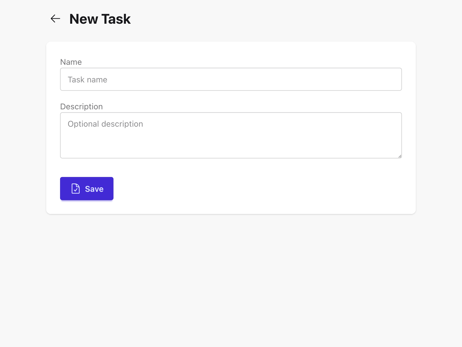
New Task Page
new_task.gleam gets the same page-level layout as the tasks screen — centred container, bold heading. The form content and actions are wrapped in a card to give them a clean white surface against the grey background:
gleam
// client/src/page/new_task.gleam

pub fn view(model: Model) -> Element(Msg) {
  html.div([attribute.class("min-h-screen bg-base-200")], [
    html.div([attribute.class("container p-4 mx-auto max-w-2xl")], [
      html.div([attribute.class("flex gap-2 items-center mb-6")], [
        html.button(
          [
            attribute.class("btn btn-ghost btn-sm btn-circle"),
            event.on_click(UserClickedBack),
          ],
          [
            html.span(
              [attribute.class("icon-[heroicons--arrow-left] size-5")],
              [],
            ),
          ],
        ),
        html.h1([attribute.class("text-2xl font-bold")], [
          element.text("New Task"),
        ]),
      ]),
      html.div([attribute.class("shadow card bg-base-100")], [
        html.div([attribute.class("card-body")], [
          case model.error {
            None -> element.none()
            Some(err) ->
              html.div([attribute.class("mb-4 alert alert-error")], [
                element.text(err),
              ])
          },
          task_form.view(model.name, model.description, None)
            |> element.map(FormMsg),
          html.div([attribute.class("flex gap-2 mt-6")], [
            html.button(
              [
                attribute.disabled(model.submitting),
                attribute.class("btn btn-primary"),
                event.on_click(UserSubmittedForm),
              ],
              [
                case model.submitting {
                  True ->
                    html.span(
                      [attribute.class("loading loading-spinner loading-sm")],
                      [],
                    )
                  False ->
                    html.span(
                      [attribute.class("icon-[heroicons--document-check] size-5")],
                      [],
                    )
                },
                element.text(case model.submitting {
                  True -> "Saving..."
                  False -> "Save"
                }),
              ],
            ),
          ]),
        ]),
      ]),
    ]),
  ])
}
The Back button becomes btn btn-ghost btn-sm btn-circle — a small circular ghost button that sits beside the heading without drawing too much attention. The Save button swaps its icon for a spinner and its label for "Saving..." while the form is submitting — immediate feedback that the request is in flight.
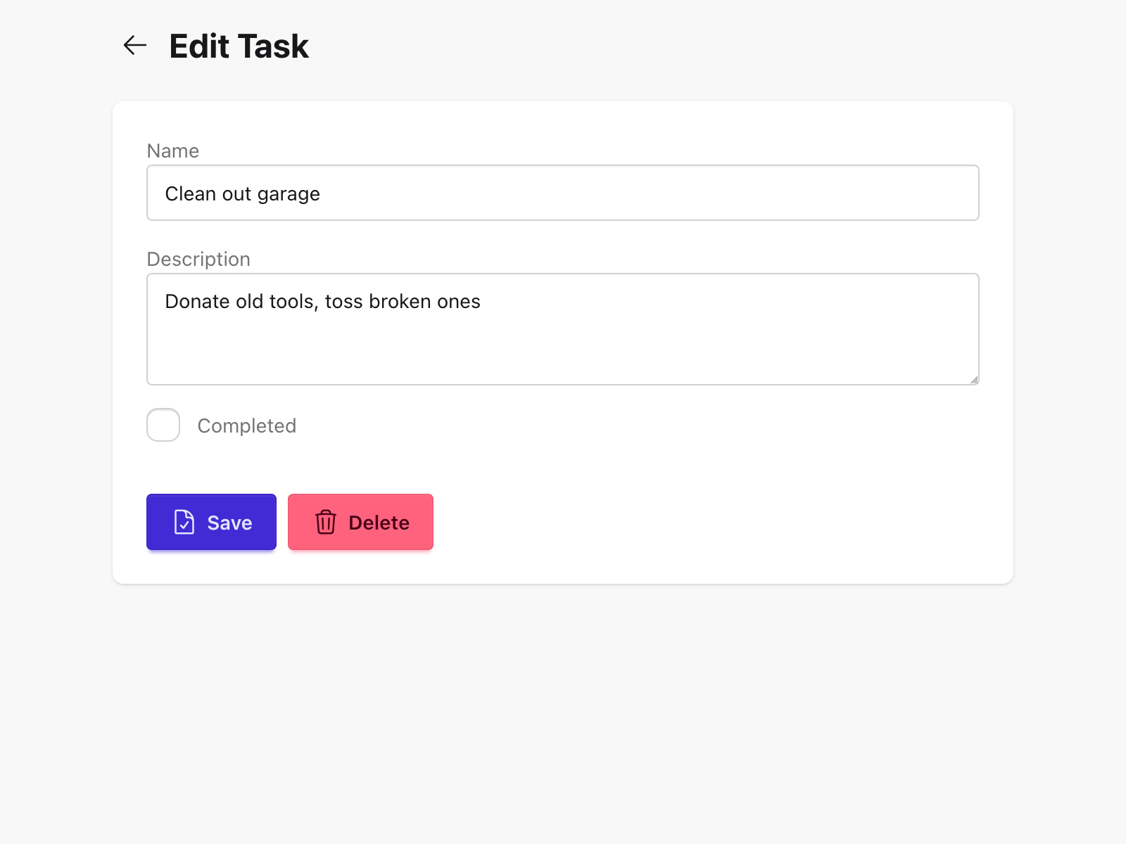
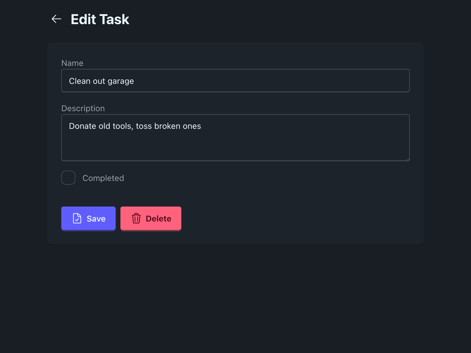
Edit Task Page
edit_task.gleam mirrors the new task page layout — same card wrapping, same max-w-2xl container — and adds a Delete button. The loading state — previously a <p>Loading…</p> — becomes a centred full-screen spinner:
gleam
// client/src/page/edit_task.gleam

pub fn view(model: Model) -> Element(Msg) {
  case model.loading {
    True ->
      html.div(
        [
          attribute.class(
            "min-h-screen bg-base-200 flex items-center justify-center",
          ),
        ],
        [
          html.span(
            [attribute.class("loading loading-spinner loading-lg")],
            [],
          ),
        ],
      )
    False ->
      html.div([attribute.class("min-h-screen bg-base-200")], [
        html.div([attribute.class("container p-4 mx-auto max-w-2xl")], [
          html.div([attribute.class("flex gap-2 items-center mb-6")], [
            html.button(
              [
                attribute.class("btn btn-ghost btn-sm btn-circle"),
                event.on_click(UserClickedBack),
              ],
              [
                html.span(
                  [attribute.class("icon-[heroicons--arrow-left] size-5")],
                  [],
                ),
              ],
            ),
            html.h1([attribute.class("text-2xl font-bold")], [
              element.text("Edit Task"),
            ]),
          ]),
          html.div([attribute.class("shadow card bg-base-100")], [
            html.div([attribute.class("card-body")], [
              case model.error {
                None -> element.none()
                Some(err) ->
                  html.div([attribute.class("mb-4 alert alert-error")], [
                    element.text(err),
                  ])
              },
              task_form.view(
                model.task.name,
                model.task.description,
                Some(model.task.completed),
              )
                |> element.map(FormMsg),
              html.div([attribute.class("flex gap-2 mt-6")], [
                html.button(
                  [
                    attribute.disabled(model.submitting),
                    attribute.class("btn btn-primary"),
                    event.on_click(UserSubmittedForm),
                  ],
                  [
                    case model.submitting {
                      True ->
                        html.span(
                          [attribute.class("loading loading-spinner loading-sm")],
                          [],
                        )
                      False ->
                        html.span(
                          [attribute.class("icon-[heroicons--document-check] size-5")],
                          [],
                        )
                    },
                    element.text(case model.submitting {
                      True -> "Saving..."
                      False -> "Save"
                    }),
                  ],
                ),
                html.button(
                  [
                    attribute.disabled(model.submitting),
                    attribute.class("btn btn-error"),
                    event.on_click(UserClickedDelete),
                  ],
                  [
                    html.span(
                      [attribute.class("icon-[heroicons--trash] size-5")],
                      [],
                    ),
                    element.text("Delete"),
                  ],
                ),
              ]),
            ]),
          ]),
        ]),
      ])
  }
}
The Delete button is btn btn-error — DaisyUI's red variant — making it visually distinct from the primary Save action. Both buttons are disabled while the form is submitting, preventing double-submissions.
Running the Dev Server
sh
cd client
gleam run -m lustre/dev start
lustre_dev_tools shells out to the Tailwind CLI to compile client.css, watches both the Gleam source and the stylesheet for changes, and serves the result at http://localhost:1234. The app now has a proper layout: a task list rendered as cards with completion state, loading spinners, error alerts, and form pages with consistent styling throughout.
What's Next
The web app is feature-complete, tested, and styled. The next question is: how do other people use it? Next, we'll containerise the client, hand it to Caddy, and deploy the full stack — database, API, and frontend — to a real server.